Page 6 - 2018 Your Home Your Way
P. 6
6                                                       THE BRANDON SUN  • YOUR HOME YOUR WAY • 2018


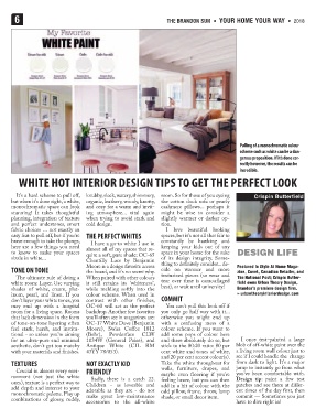
                                                                                          Pulling of a monochromatic colour
                                                                                          scheme such as white can be a dan-
                                                                                          gerous proposition. If it’s done cor-
                                                                                          rectly however, the results can be
                                                                                          incredible.
        WHITE HOT INTERIOR DESIGN TIPS TO GET THE PERFECT LOOK


       It's a hard scheme to pull off,  knubby, sleek, watery, shimmery,  room. So for those of you eyeing  Crispin Butterfield
     but when it's done right, a white,  organic, leathery, woody, knotty,  the cotton duck sofa or pearly
     monochromatic space can look  and cozy for a warm and invit-  cashmere pillows... perhaps it
     stunning! It takes thoughtful  ing atmosphere... vital again  might be wise to consider a
     planning, integration of texture  when trying to avoid stark and  slightly warmer or darker op-
     and perfect undertones, smart  cold design.             tion.
     fabric choices … not exactly an                           I love beautiful looking
     easy feat to pull off, but if you're  THE PERFECT WHITES  spaces, but it's not all that fair to
     brave enough to take the plunge,  I have a go-to white I use in  constantly be hawking and
     here are a few things you need  almost all of my spaces that re-  keeping your kids out of any
     to know to make your spaces  quire a soft, pure shade: OC-65  space in your home for the sake  DESIGN LIFE
     sizzle in white...                                      of its design integrity. Some-
                                 Chantilly Lace by Benjamin
                                 Moore is a design favorite across  thing to definitely consider... de-  Featured in Style At Home Maga-
     TONE ON TONE                the board, and it's no secret why.  cide on warmer and more  zine, Covet, Canadian Retailer, and
       The ultimate rule of doing a  When paired with other colours  texturized pieces (so wear and  The National Post; Crispin Butter-
     white room: Layer. Use varying  it still retains its 'whiteness',  tear over time is camouflaged  field owns Urban Theory Design,
     shades of white, cream, plat-  while melding softly into the  best), or wait until university!  Brandon’s premiere design firm.
     inum, pearl, and linen. If you  colour scheme. When used in                         » urbantheoryinteriordesign.com
     don't layer your white tones, you  contrast with other finishes, COMMIT
     may end up with a hospital  OC-60 will act as the perfect  You can't pull this look off if
     room for a living space. Rooms  backdrop. Another few favorites  you only go half way with it...
     that lack dimension in the form  you'll often see in magazines are:  otherwise you might end up
     of tone-on-tone layering often  OC-17 White Dove (Benjamin  with a confusing mess of a
     feel stark, harsh, and institu-  Moore), Swiss Coffee 1812  colour scheme. If you want to
     tional - so unless you're aiming  (Behr),  Powderface  CLW  add some pops of colour here
     for an ultra-pure and minimal  1034W (General Paint), and  and there absolutely do so, but  I once test-painted a large
     aesthetic, don't get too matchy  Antique  White (CIL RM  stick to the 80:20 ratio: 80 per  blob of off-white paint over the
     with your materials and finishes.  43YY 78/053).        cent white and tones of white,  a living room wall colour just to
                                                             and 20 per cent accent colour(s).  see if I could handle the  change
     TEXTURES                    NOT EXACTLY KID             Take the white throughout for  from dark to light. It's a major
       Crucial in almost every envi-  FRIENDLY               walls, furniture, drapes, and  jump to instantly go from what
                                                                                        you’ve been comfortable with.
     ronment (not just the white   Sadly, there is a catch 22.  maybe even flooring if you’re  Design tip:  paint a few test
     ones), texture is a perfect way to  Children - as loveable and  feeling brave, but you can then  patches and see them at differ-
     add depth and interest to your  adorable as they are - do not  add in a hit of colour with the  ent times of the day first, then
     monochromatic palette. Play up  make great low-maintenance  odd pillow, frame, throw, lamp  commit — Sometimes you just
     combinations of glossy, ruddy,                          shade, or small decor item.
                                 accessories to the all-white                           have to dive right in!

